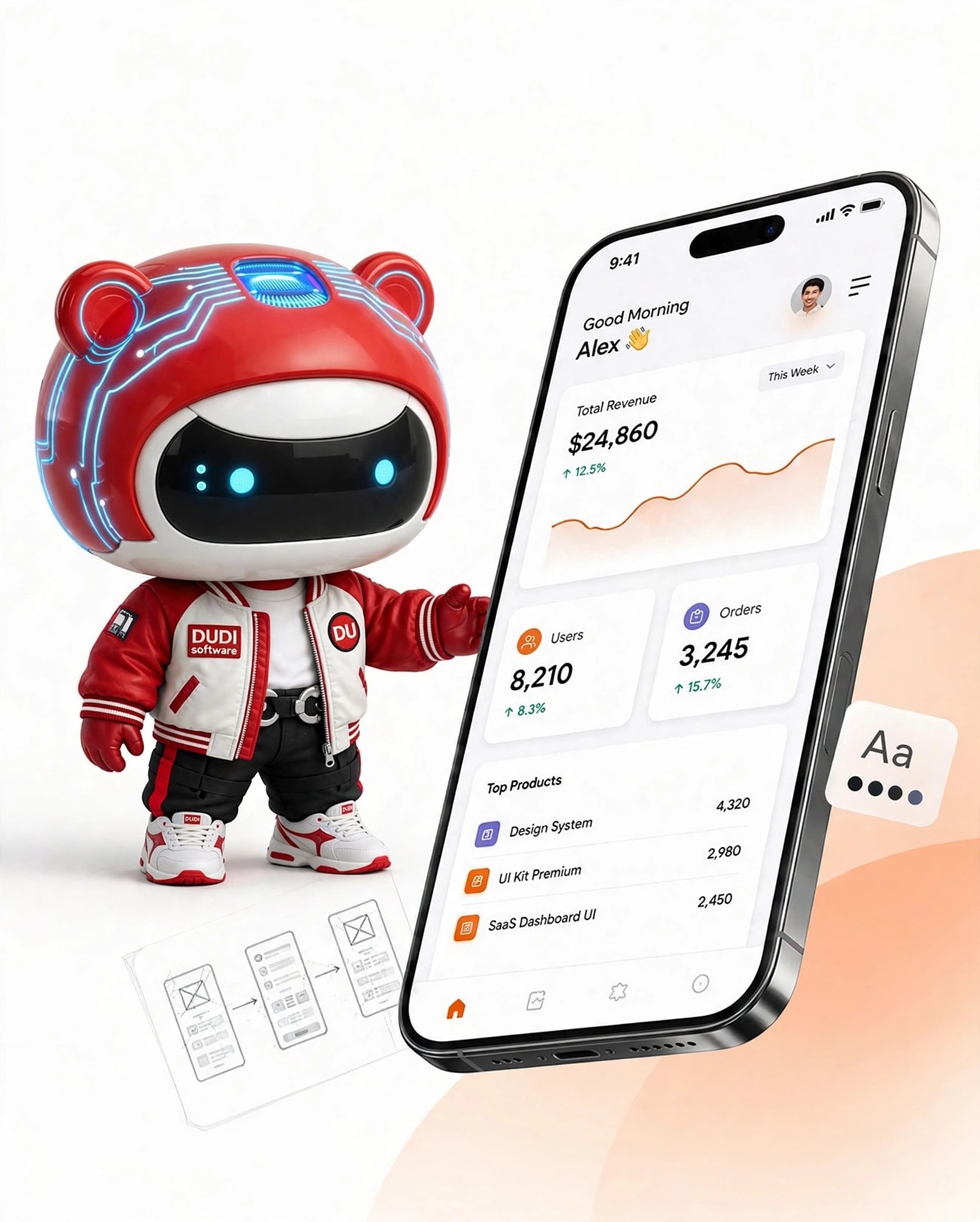
Mobile-First Standard Website Design: Optimizing Google Experience and Ranking
With over 70% of internet traffic now coming from mobile devices, website design can no longer simply start on a computer screen and then scale it up for phones. Google's Mobile-First Indexing algorithm has officially chosen the mobile version as the sole benchmark for evaluating quality, indexing, and ranking all search keywords.
The mobile-first website design process requires a complete shift in interface architecture thinking:
- Optimize the Thumb Zone: The majority of users operate their phones with one hand. Therefore, call-to-action (CTA) buttons, navigation menus, and the search bar should be prioritized and placed in the lower half of the screen – the area where the thumb can most naturally reach. The size of touch points must be at least 48x48 pixels to completely prevent accidental presses.
- Minimizing visual complexity: Unlike the vast space of a desktop computer, a phone screen demands a high degree of conciseness. Mobile-First website design eliminates cumbersome multi-column tables, shifting to a single-column vertical card layout, combined with flexible open and close content blocks (Accordion) to help users quickly find the necessary information without excessive scrolling.
- Conditional resource loading: The programming process needs to clearly differentiate between the accessing device to only load CSS files and images that are actually necessary for the small screen, avoiding forcing the phone to load heavy graphic effects that are only intended for computers.
At DUDI Software, our website design services are always centered around the Mobile-First philosophy. Every line of code and every interface element is meticulously refined to deliver a smooth, lag-free browsing experience, guaranteeing page load speeds under 1.2 seconds on mobile devices and creating a solid foundation to propel your brand to the top of search engine rankings.