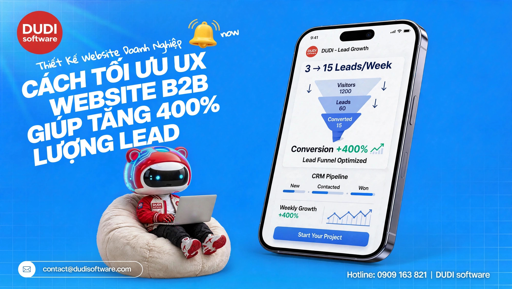
From 3 leads to 15 leads/week: How have we changed the customer flow on the website?
Last June, the Marketing Director of VinaTech (an automation engineering company) approached DUDI Software in a state of stress.
They consistently spend 80 million VND on Google Ads every month. Traffic is very stable, and the graphs are always trending upwards. But the results? On average, they only receive 2-3 contact forms per week, mostly from students asking for documents or small price quotes that aren't relevant to their B2B target audience. The bounce rate has reached 82%.
They asked us to optimize the page load speed, because they believed that "the slow website load speed is probably why customers are getting discouraged."
I opened the behavior flow analysis report and shook my head. The website loads in under 2.5 seconds, which is great. The problem isn't the speed. The problem is that this website is psychologically torturing its users.
If you invite customers into a supermarket but hide the checkout counter, they will abandon their shopping cart and leave. VinaTech's website does exactly that.
We have "diagnosed" and surgically addressed 3 critical points on the page:
1. The first screen (above the fold) is completely blank. When customers click from Ads (searching for "automatic conveyor belt solutions") to the homepage, they are immediately confronted with a huge banner that reads: "VinaTech - Reaching New Heights," accompanied by a 3-minute company introduction video.
- DUDI's solution: We immediately removed that cliché. Instead, we used a headline that directly addressed the solution: "Automated Conveyor System: Reduce Warehouse Personnel Costs by 30%" . Right below that was a clear CTA button: "Calculate Installation Costs" .
2. Concealing Social Proof of Capabilities: B2B customers don't buy based on emotion; they buy based on reason and trust. VinaTech's capability reports, ISO certifications, and logos of its major partners are tucked away on a hidden subpage within the "About Us" menu.
- DUDI's solution: Immediately move the "Implemented Case Studies" content block to the homepage, placing it right below the service introduction. After viewing the solution, customers should immediately see if anyone has used it and achieved success.
3. The contact form is too lazy. The contact page only has 3 fields: Name, Email, and Message. Customers don't know what to write in the "Message" field.
- DUDI's solution: Switch to a structured quote form. Customers only need to select: Factory type, Estimated budget, and Phone number. Transform complex data entry into simple click-based operations.
Results after 30 days of implementation
We didn't increase VinaTech's advertising budget by a single penny. The entire change was in the UX/UI layer of the website.
- The bounce rate decreased from 82% to 45%.
- The number of high-quality leads (the right B2B audience with genuine needs) skyrocketed from 3 leads to 15 leads per week.
- Cost per lead (CPA) decreased by 60%.
Designing a business website has never been an art competition. It's a psychological challenge. You have to understand what your customers need in the 3rd second, the 10th second, and provide exactly that to keep them engaged.
Don't blindly increase your advertising budget when your sales funnel (website) is still at the bottom.
If you're running ads regularly but your conversion rate is stuck below 1%, please leave your website link. The DUDI Software team will help you diagnose the problem and identify the bottlenecks that are causing your customers to leave.