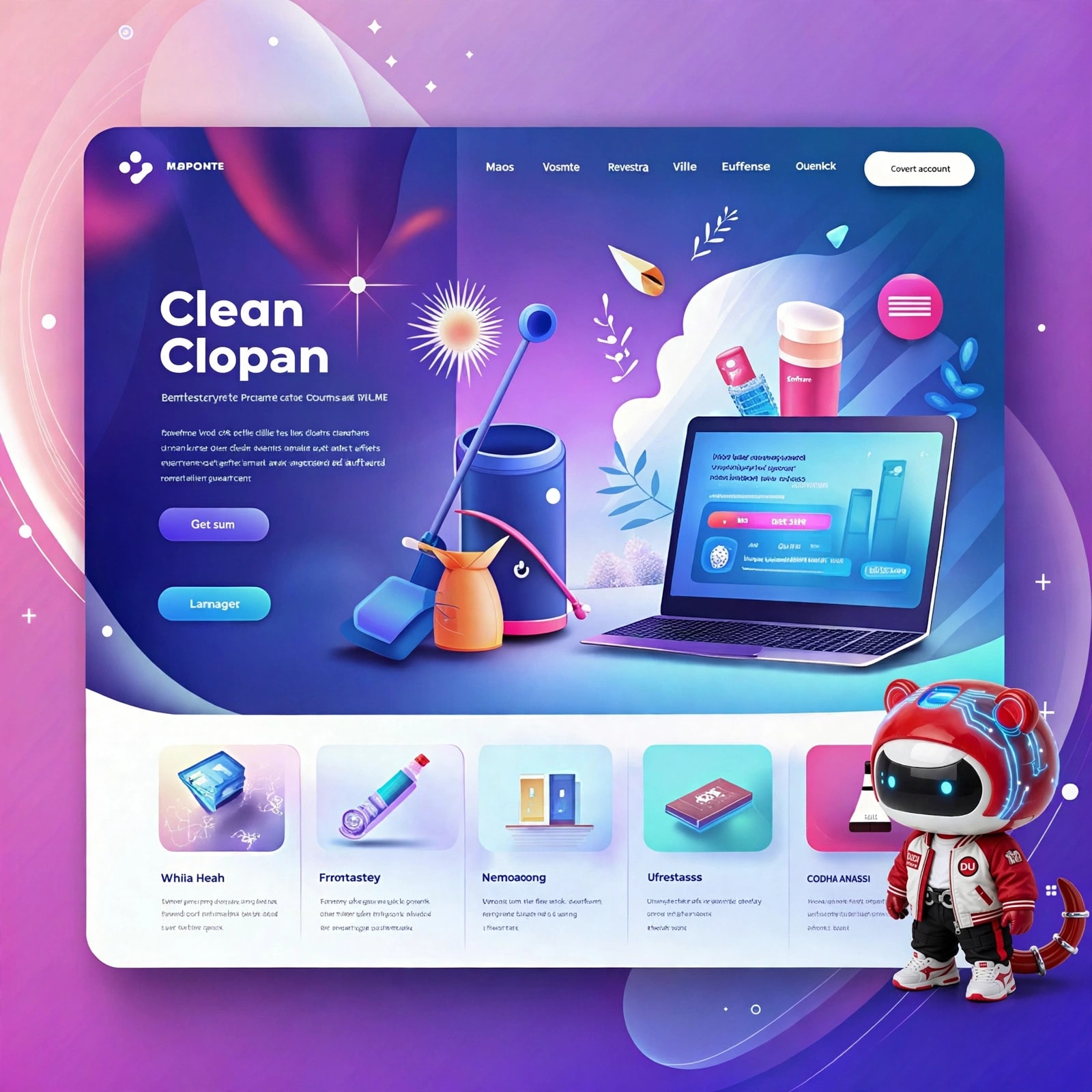
Color in Website Design: The Art of Navigating Customer Emotions
Consumer behavior studies indicate that customers take less than 90 seconds to make an initial assessment of a product online, and 60% to 90% of that assessment is based entirely on color. In website design , color is not simply decorative; it's a powerful psychological tool that directly impacts the hypothalamus in the brain, evoking emotions and influencing conversion behavior.
Each color in the digital space carries its own unique "emotional frequency":
- Blue: Represents stability, security, and transparency. This is why financial corporations, banks, insurance companies, and B2B software companies always prioritize blue in their website designs to build absolute trust with partners.
- Green: Evokes nature, health, and regeneration. This color scheme is particularly effective for websites selling healthy food, vegan cosmetics, or healthcare services.
- Orange and red: These colors stimulate appetite, create a sense of urgency, and encourage action. They are classic colors for call-to-action (CTA) buttons such as "Buy Now" or "Order Now" on e-commerce platforms or F&B restaurant websites.
To maximize the power of color palettes, modern website design processes strictly adhere to the 60-30-10 color scheme rule :
- 60% Dominant Color: Usually neutral colors (white, light gray, or minimalist black) serve as a foundation, creating breathing space for the user's eyes.
- 30% Secondary Color: This color represents the brand identity and is used for navigation bars, article title tags, and to highlight the interface structure.
- 10% Accent Color: The most contrasting color scheme, appearing exclusively on key conversion buttons (Registration Form, Shopping Cart).
A successful website design project is one where color guides the user's gaze naturally through valuable messages and stops at the right point to finalize the purchase. Mastering the language of color is key to transforming a static interface into a powerful sales machine for your business.